• FEATURED WORK
  • ABOUT
  • BLOG
  • CONTACT
Liz Schwartz | Creative Director
  • FEATURED WORK
  • ABOUT
  • BLOG
  • CONTACT

Developing A New Brand of Yogurt

There is no better challenge than to have a client say "I have an idea..." and to bring that to life and onto the store shelf. Last year I had the pleasure of working with WhiteWave Foods and Growth Catalysts to develop several new ideas for an Australian Style yogurt brand. 

Through months of work on naming, brand positioning, identity, and packaging we worked with the internal creative team at WhiteWave on several new products, one of which is now available at grocery stores across the country... Yulu Yogurt. 

Not only is the development of a new brand incredibly fun, but it's also a great challenge for any design team to open up the possibilities of where a product can go. I count myself lucky that we were able to integrate consumer feedback into our work and create a brand that we can feel proud to put out onto store shelves. 

tags: packaging, branding, innovation, food packaging, creativity
Monday 02.09.15
Posted by Liz Schwartz - Creative Director
 

Consumers Say...Make It Easy!

We've been hearing quite a bit lately about the need to create easier-to-open consumer packaging. We've expressed our thoughts about the clamshell before but across the board, the consumer product manufacturers are making things harder on consumers than they need to be.

Wrap Rage

A recent article in England's Telegraph showed how 4 out of every 10 consumers have experienced injuries while trying to open a product they've purchased. 4 out of 10! This takes  "wrap rage"  to a whole new level. As Which researcher Joanna Pearl says, "If you bought a car you'd be furious if it proved difficult to open the door, but the struggle to get into everyday packaged goods is seen as something we must tolerate."

If you want your brand to speak to your consumer and create a positive experience, that experience should continue after they've taken your brand off the shelf. You owe it to your consumers to create a positive product and packaging experience if you expect them to consider purchasing your products again. Making your packaging easy to open, and easy to re-seal (if applicable) should be one of your top packaging considerations.

"If you bought a car you'd be furious if it proved difficult to open the door, but the struggle to get into everyday packaged goods is seen as something we must tolerate."


Make it easier to use

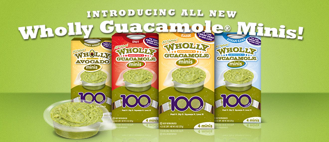
We've seen several companies lately improving on their openablility and increasing the function for today's modern consumer, our favorite being the new dip cups from Wholly Guacamole. They started with a good product (and package)... the 100 calories packs keep your guacamole fresher for longer as you are only opening one single serving at a time. If you were to ask their consumers they probably would have said that the packaging was great... but that didn't mean there wasn't further opportunity. With the newly designed packs, they've utilized a slightly more rigid plastic to create a dippable cup, increasing the usage of their product and making it easier for mom to hand off to her kids for a quick snack. Easy to open, easy to use.


Theft protection doesn’t have to be frustrating

We understand that you don't want the package to come apart in-store, especially when dealing with electronics or other high end goods. When we developed new packaging for Chargz, we developed a structure that was the best of both worlds. With an opening in the back to allow the consumers to test the chargers with various electronics, we provided convenience in a package that prevented in-store theft. 

As an industry we should be doing everything we can to make everything we package easy to open and a pleasant experience from retail to home. Isn't that really the key to brand loyalty?


Originally Published at: http://pkgbranding.com/consumers-say-make-it-easy/ 


Source: http://pkgbranding.com/consumers-say-make-...
tags: packaging, packaging structure, consumers
categories: Brand Strategy, Writing
Monday 08.26.13
Posted by Liz Schwartz - Creative Director
 

Packaging Masculinity? Wrap it in Black.


There's an article posted on Good Magazine about marketing to the sexes through product packaging. There are some interesting ideas in here, like author Leatrice Eiseman's argument that the abundance of male targeted black packaging has to do with the popularity of Darth Vader.

tags: packaging
Sunday 10.23.11
Posted by Liz Schwartz - Creative Director
 

Jack Daniel’s Packaging Refresh

I found this to be an exemplary case study on how to modernize and update a heritage brand without just change for changes sake. The simplification and reorganization of the face panel really incorporates a lot more white space, making it easier for the consumer to read the content. The subtle hints of grey and dimension keep the packaging looking premium without overdoing it. The refresh of the side panels begins to tell a much clearer brand story and reinforces the important heritage items without being cluttered. The icons that were developed look both typical of Jack Daniel’s but refreshing and new, an incredibly hard balance to achieve.

Overall, the new label design really encourages you to read and engage with the brand story after removing all of the less important seals and periphery claims. The design (and brand team) did a magnificent job of editing. While I’m sure the average consumer will not notice much of a change on shelf, I think this is a huge step in the right direction. It’s always a challenge with a brand like this that has as much equity as Jack Daniels to update without over-doing or creating something new that consumers will not connect with.

 The case study is available on Packaging of the World.

tags: branding, packaging
Wednesday 10.12.11
Posted by Liz Schwartz - Creative Director
 

Trendspotting: "Rightsizing" Packaging

I came across an interesting article in the Wall Street Journal about Coca-Cola's new efforts to downsize it's packaging. They are approaching this not from the financial considerations of the ingredients (unlike the ice cream market) but from an effort to address shoppers who are watching their calories and watching their wallets. 16 oz bottles are now being introduced at a 99¢ price point and Coke seems fine with basardizing the sales of their 20 oz and 12 oz cans to do it.

Read about it at The Wall Street Journal or at Forbes.

tags: packaging, trends
Thursday 09.22.11
Posted by Liz Schwartz - Creative Director
 

How much is too much? Packaging environmental overload.

The Battling The Backlash article in Brand Packaging makes some interesting points about how much messaging a consumer can absorb on pack. Especially in a market like bottled water where brands are trying to create a point of difference and respond to the negative environmental criticism.

tags: green, packaging
Saturday 08.13.11
Posted by Liz Schwartz - Creative Director