• FEATURED WORK
  • ABOUT
  • BLOG
  • CONTACT
Liz Schwartz | Creative Director
  • FEATURED WORK
  • ABOUT
  • BLOG
  • CONTACT

How packaging can make food more flavorful

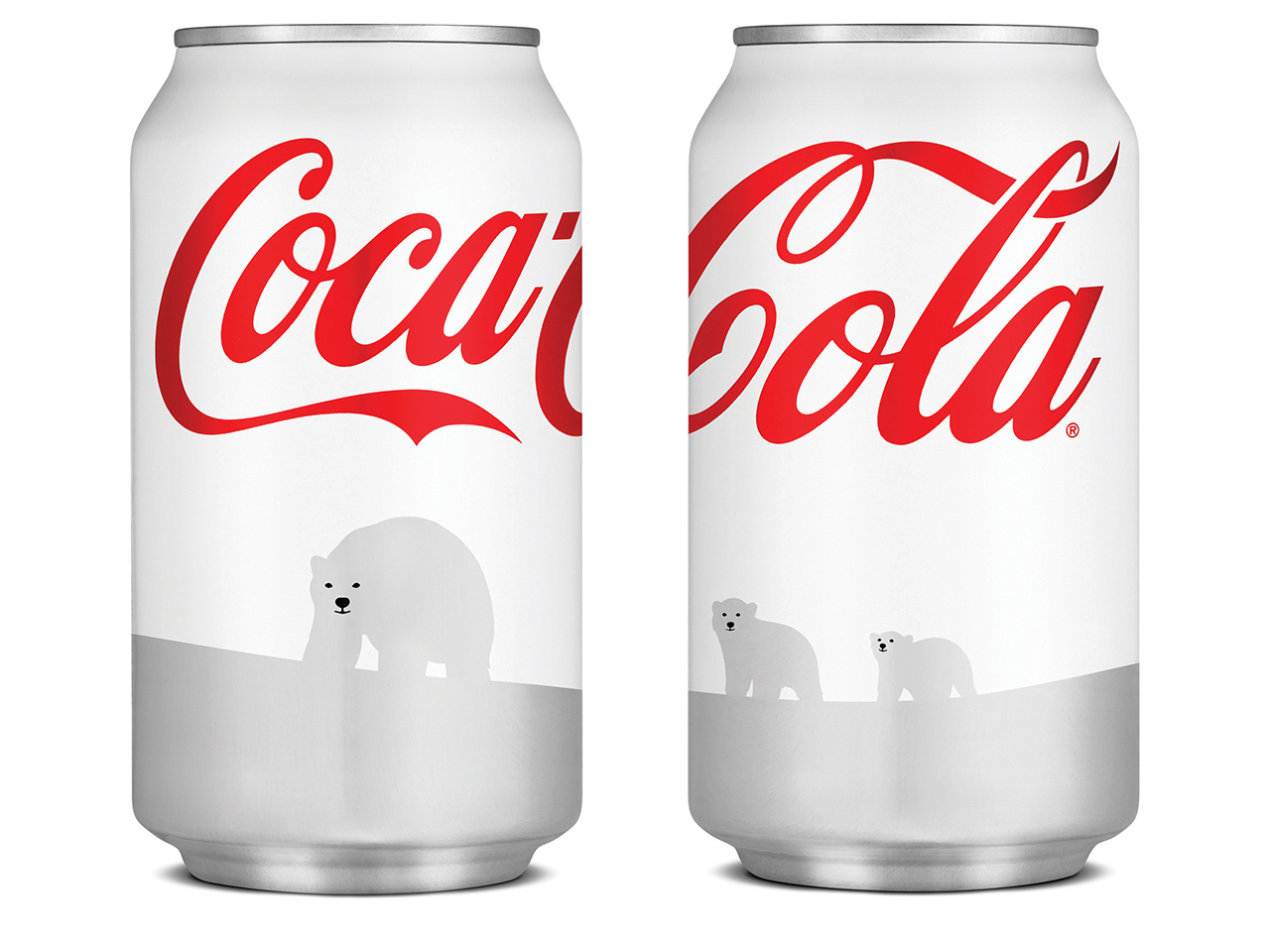
Coca Cola's infamous white can experiment failed, partly because consumers perceived a formula change due to the new packaging color.


A fascinating article came out in the New Yorker this week focused on the work of Charles Spence at Oxford University. This professor of experimental psychology has been doing tremendous work with consumer perception and food, using all kinds of sensory variables like sound, color and packaging to study how the human brain naturally perceives differences. His 2004 study with Pringles showed that “that the Pringles that made a louder, higher-pitched crunch were perceived to be a full fifteen per cent fresher than the softer-sounding chips. The experiment was the first to successfully demonstrate that food could be made to taste different through the addition or subtraction of sound alone.”

Freshness, saltiness, sweetness, all of these are naturally altered by consumers with sound and color. His findings are fascinating and definitely worth a read. For instance his analysis of the 2011 Coca-Cola white polar bear packaging, universally regarded as a misstep for the normally packaging savvy Coca-Cola, was not only an issue of differentiation between Diet Coke but that by packaging the product in a white can, it is perceived to be less sweet. No wonder so many consumers complained about formulation changes!

It was withdrawn when consumers complained that Coca-Cola had also changed its secret formula. For Spence, the can is evidence of the power of a package’s color to alter the taste of the contents. His lab has repeatedly shown that red, the usual color of a Coke can, is associated with sweetness; in one experiment, participants perceived salty popcorn as tasting sweet when it was served in a red bowl.

Great read: Accounting for Taste – How packaging can make food more flavorful by Nicola Twilley

Originally published at Pivot-Forward.com
http://www.pivot-forward.com/how-packaging-can-make-food-more-flavorful/

categories: Design, Brand Strategy, Writing
Wednesday 10.28.15
Posted by Liz Schwartz - Creative Director
 

Design for the Greater Good

“Joanne is a young Army Veteran who is looking to make use of her GI Bill Benefits and apply for federal student loans to attend college.

In trying to access the federal programs which will allow her to afford college, Joanne must navigate the websites of multiple agencies. She finds dozens of government websites which all seem relevant to what she’s looking for. Joanne is confused. Are these programs related to each other? Are they even all a part of the federal government? Are any of these a scam? When she tries to access the sites on the bus on her commute to work, she finds half of them are impossible to use on her phone. She’s overwhelmed by how hard these tools are to use, misses opportunities she’s eligible for, and feels frustrated and isolated.

Joanne is not alone. When the American people go online to access government services, they’re often met with confusing navigation systems, a cacophony of visual brands, and inconsistent interaction patterns.”
— 18F Case Study
home.png


"To best serve users like Joanne, we need to set a new bar for simplicity and consistency across government services, not just within a given agency or program."

18F wrote a fantastic case study to showcase WHY it's so important to create unified and thoughtful design for the US Government. Great work. 

https://18f.gsa.gov/2015/09/28/web-design-standards/

Monday 10.05.15
Posted by Liz Schwartz - Creative Director
 

Design as Disruptor

I'm excited for this new documentary DESIGN DISRUPTORS - HOW DESIGN BECAME THE NEW LANGUAGE OF BUSINESS - A DOCUMENTARY BY INVISION

“People have choice now, if they open it up and in a few second they don’t immediately understand the value, they’re done.”
— - Mia Blume , Pinterest Product Design Manager
Sunday 10.04.15
Posted by Liz Schwartz - Creative Director
 

A design call to arms

UPDATE: Based on the response I've received today, I've launched DesignCallToArms.com to organize like-minded designers in creating highly shareable content about gun violence in America. 

______

Last night, I listened to the president talk after yet another mass shooting in a school in America. He issued a call to arms to the American people to DO SOMETHING about the continued gun violence and mass shootings because he can't do it alone. We can't sit idly by while one group of Americans defends their rights to carry guns, while NO ONE defends the rights of the countless victims. As I listened to the reports and watched the reactions of my friends on social media, my friend Kari said something that really hit home:

You know, I appreciate that you have a right to have a gun. But what about MY right to not get gunned down in a movie theater? What about my nephew's right to go to school without fear of being shot? Why are the rights of those who don't want to live in fear of some trigger happy maniac somehow discounted against the almighty gun lobby?

The president called on the media to showcase to the American public the scale of this continuing national tragedy. And for a few hours I was hopeful until I saw reports like this from Vox trickle in. Their heart was in the right place, the statistics were correct, but the designer in me looked at that "chart" and gasped. This is NOT the right format to showcase the scale of these numbers. And it hit me... I can help. 

I'd like to issue a design call to arms to all my fellow designers... please help me showcase the scale of the problem. Bring the numbers to life in anyway possible to showcase to all Americans how much they need to get involved and ensure that their voice is being expressed through their elected officials. President Obama was right last night, we won't ever stop this violence unless all Americans; liberals, conservatives, independents, responsible gun owners, et al. speak up. 

DesignCallToArms.com

So please, help me take the statistics available to us and make them VISIBLE.  I'm gathering all the statistics and news articles I can find that showcase the supposed "scale" of the ongoing cycle of violence. I'll continue to amend this post and add every trustworthy source I can to help us report the numbers in a visually engaging way.

Sources & Statistics: 
U.S. Dept of Justice - Firearm Violence Report 1993-2011

Bureau of Justice Statistics

categories: Design, Inspiration
Friday 10.02.15
Posted by Liz Schwartz - Creative Director
Comments: 2
 

When is it time to update your packaging?

“Deciding to change your packaging should never be taken lightly,” says Phil Duncan, P&G’s Global Design Officer.

“There are typically numerous consumer and market dynamics that combine to signal the need to change your package. Consumer understanding and trends, a change in brand strategy, or significant shifts in the category or retail channels can all create an environment to consider a packaging change.”

There’s a good read on Forbes today for any brand leader wondering when it’s the right time for a change. There are a million reasons you could decide to evolve or refresh your brand, but what are the right considerations?

MARKETPLACE CHANGES

Do you have a new competitor that’s making waves in your category? It could be time to reinforce your brand story to re-engage your consumers. Significant shifts in your category or retail channels should always have you evaluating your packaging against the evolving competitive set.

CONSUMER TRENDS

Are consumers moving away from your shelf stable products and heading towards products with more perceived “freshness”? Perhaps you’re noticing demographic shifts in your consumer and it’s time to reposition to regain younger consumers. Take stock of the larger trends happening in your sector and category to understand when it might be time to evolve.

BRAND STRATEGY

Your packaging should NEVER change as much as your advertising efforts, but if your packaging no longer reflects your brand strategy, it’s time for a change.

Would you just like another point-of-view? Contact us to have our experienced brand leaders walk you through the considerations for a packaging change.

(Originally posted on Pivot-Forward.com)

categories: Brand Strategy, Writing
Monday 09.28.15
Posted by Liz Schwartz - Creative Director
 

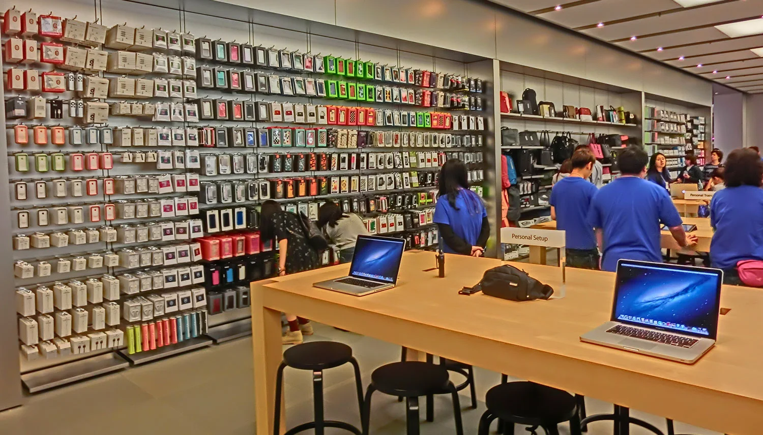
Apple, the new packaging bully.

As a packaging designer, this article from 9to5 Mac leaves me speechless. Apple is apparently working with several of their accessory suppliers to re-design their packaging to Apple's standards. Huh? I'm all for Apple trying to elevate the packaging of 3rd party products but this puts anyone selling on a wall peg at a huge disadvantage.

Why? Apple's product packaging doesn't have to communicate anything.

Consumers don't see it until the sales person pulls it out of the secret back room and puts it in your hand. No consumer walks into a store thinking... "I need a computer" and evaluates an HP laptop box next to a MacBook Pro box, but that's the very real scenario facing third party products within an Apple Store. 

Image from 9to5 Mac

Image from 9to5 Mac

According to 9to5 Mac the photo above is an example of updated packaging for Mophie and Logitech as designed by Apple. I presume there will be some serious hurdles for consumers to understand benefits and brands when everything on the wall is white and black. Are brand supposed to just discard their own brand equity for the pleasure of appearing on a peg in an Apple Store? I guess so. 

I'm all for good design. I love white space and cleanliness as much as the next designer but it's going to be a serious challenge now for accessory suppliers to have any kind of shelf breakthrough. 

Tuesday 07.07.15
Posted by Liz Schwartz - Creative Director
 

"You know, for kids."

Mike Monteiro does it again... with a great keynote speech for the Interaction Design Association.

One of the hardest things a young designer has to do is not to do good work (in theory they've been trained to do that), it's to be able to sell the work. To explain to the client the WHYs. WHY they did it this way. WHY it will work. WHY consumers/users will understand their message/be able to navigate their site/donate to their case/buy their products/etc. 

In the way that only Mike Monteiro can (and utilizing points from one of the best movie's of all time, The Hudsucker Proxy), he boils the message down to two simple points: 

  1. Do good work.
  2. Persuade them it's good. 
Wednesday 05.20.15
Posted by Liz Schwartz - Creative Director
 
Newer / Older