• FEATURED WORK
  • ABOUT
  • BLOG
  • CONTACT
Liz Schwartz | Creative Director
  • FEATURED WORK
  • ABOUT
  • BLOG
  • CONTACT

Creating a Billboard with Packaging

One of the best ways to gain more consumer attention on-shelf with your products is to unify multiple packages with the billboarding effect. If your packages interact with each other, their visual impact is spread across a larger surface area and you are more likely to capture consumer attention.

GoldenGrainShelfSet1.jpg

When PKG refreshed the Golden Grain pasta brand, we aligned the clouds and soft rolling wheat fields to form a continuous horizon line across the shelf. When stocked with multiple SKUs on a supermarket shelf, the end affect is a rather engaging and attention getting display.

12111211.jpg

How can you accomplish this when your package is a round container that often rotates? We like this example of a recent Miller High Life refresh by Colt + Rane that demonstrates how to make multiple round packages work together. The Diet Coke Fridge packs from Turner Duckworth and Cheerios club store packaging both demonstrate how to make great use of vertical space as well.

Your packaging needs to work hard to capture consumer attention, especially in a busy retail environment. If you can unify your available shelf space to make a larger impact that on-shelf visibility will pay off through higher sales.

Originally published at http://pkgbranding.com/creating-a-billboard-with-packaging/

categories: Design, Writing
Tuesday 12.11.12
Posted by Liz Schwartz - Creative Director
 

Pin-spiration

If you haven't checked out our Pinterest site you might not realize that we are avid collectors of inspiration. After years of tacking up magazine spreads, sneaky in-store photos and random imagery onto giant bulletin boards, we became early adopters of Pinterest. It helped our inspiration remain organized and easy to look back upon. So what's inspiring us today? Hand-crafted lettering!

1203121.jpg

1 - Zombieland by Carolin Wanitzek, via Behance. | 2 - Beautiful lettering work from Tommaso Guerra. | 3 - Corrugate cardboard type from Farah Tamachi's senior thesis. More inspiration available on my Type Lovers board on Pinterest.

Originally published on http://pkgbranding.com/pin-spiration/

categories: Inspiration, Writing
Monday 12.03.12
Posted by Liz Schwartz - Creative Director
 

How do you breathe new life into a classic brand?

MuellersPKG11.jpg

I've had the pleasure of becoming a pasta expert over the past year as PKG worked with American Italian Pasta Company on the refresh of their regional pasta brands. The Mueller's brand has over 145 years of history with consumers in the Northeast United States. AIPC came to PKG to bring the brand along with modern audiences while retaining it's classic American heritage. We developed many concepts to see how far consumers would let us take this brand, and in the end we found a way to modernize while maintaining it's classic equity.

MuellersPKG21.jpg

The pasta aisle is historically a visually chaotic space within the grocery store, with national brands, regional brands and store brands all competing for consumer eyes. Understanding that consumer's shop their trusted brands by looking for specific cuts, we set out to create a new system to aid shopability.

MuellersPKG31.jpg

With "short cuts" like elbows and penne, we heard frequently from consumers that they want a large window to identify the pasta shapes. This provided an added challenge for "long cuts" like spaghetti and angel hair. How can you develop a quick visual cue to tell them apart when it's not readily apparent in the window? Photography of course!

MuellersPKG41.jpg

We heard through qualitative and quantitative testing that consumers were drawn to the new aspirational ingredient images as a way to tell apart their favorite cuts of pasta AND suggest a usage. Keep an eye out on grocery store shelves from Michigan to Florida as new packaging for Mueller's begins to rollout.

MuellersPKG51.jpg

Originally published at http://pkgbranding.com/breathing-new-life-into-a-class-brand-muellers-pasta/

categories: Brand Strategy, Design, Writing
Wednesday 11.07.12
Posted by Liz Schwartz - Creative Director
 

PKG

I have been singularly focused on building a new company for about a year so unfortunately, I haven't been very good about posting in this forum. Our official launch date was October 6, 2011 yet in less than 11 months it's amazing to me how far we've come. I have a solid, fearless team who takes on every new challenge with a great sense of energy and unabashed creativity. We have created some amazing work that I can't wait to debut to the world when it becomes commercially available. It's never easy to develop a new company, but I am so proud of all we have already accomplished that it makes all the long hours and hard work worth it. And this is only the beginning...

categories: Agency Management, Brand Strategy, Design, Writing
Friday 08.31.12
Posted by Liz Schwartz - Creative Director
 

Tea with Eva

EvaZeisel.jpg

It was the spring of 2001. The past year had been motivating, full of new adventures, new experiences. I was a young packaging designer working a job where I was learning something new every day and loving every new opportunity.

When I discovered that Eva Ziesel would be doing a small US tour to support her new Nambe product launch my heart skipped a beat. I have no idea how a legend like her ends up signing autographs in a suburban Chicago Marshall Field's but I wanted to be there to show my respect. My roommate, also an artist and web designer, joined me in the trek to the suburbs.

I should back up and explain how I came to love the work of one of the lesser known mid-century design legends. My parents come from the land of Red Wing Pottery. The small Minnesota-based family business made everything from craft pottery to servingware and stoneware crocks. I don't think many people outside of Minnesota and Wisconsin know this small pottery company, but in my memories they were always cherished possessions by both sides of my family tree. My maternal grandmother had several pieces of Red Wing in her cabinet, my paternal grandmother used Red Wing crocks in her farm's kitchen to make the pickles I would love to eat. This tradition of collecting Red Wing was passed down to my mother and her siblings. Nothing in my mother's pottery collection intrigued me more than Schmoo, a pair of salt and pepper shakers that were unlike anything I had ever seen before. They felt organic, smooth, comfortable even in my hands as a small child. The salt shaker wrapped around the smaller pepper with a soft elegance that as a child seemed so foreign to me. These were not simple salt and pepper shakers, they were art. They were special, hand-crafted and spoke to me.

CRI_6290.jpg

I didn't know that they spoke to other people too, not until I was in my teens and learned more about art and design. I knew nothing about the the challenges and life threatening experiences she'd overcome to even get to America and design for this small Minnesota company. I just knew that she approached every plate, cup and form differently from the 90-degree, angular 80's world I grew up in. The softness, the curves, the beauty in simplicity has always informed the work that I've done and the art that I've been drawn to.

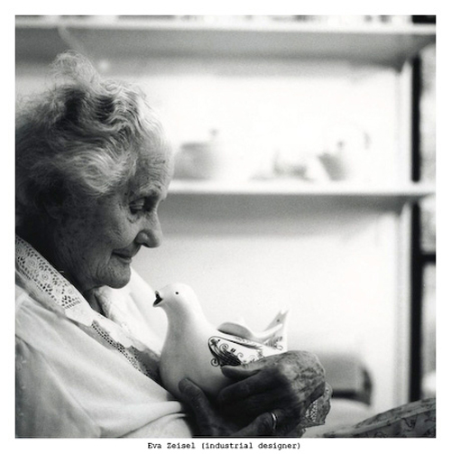
Back to 2001, my roommate and I arrived at the store towards the end of the event. We waited patiently for the suburban women–who seemed to just happen into the department store that Saturday afternoon–make pleasantries with the woman they didn't fully comprehend. Eva spoke gracefully and slowly with a tinge of her eastern European accent noticeable in her words. She was a gracious host, but clearly tired by the attention and travel. Keep in mind at this point Eva was already 94 years old! She and her daughter Jean were preparing to pack up their things when she noticed us—two twenty-something girls who were just as out of place in this upscale department store as they were. When her eyes caught mine, I like to think she recognized a kindred soul. They motioned us over and invited us to sit, talk and have a cup of tea.

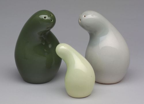
Eva was so curious about us! Who were we? How did we know who she was? What did we do? What did we love about life? Were we from Chicago? Did we love this city? Her specific words are now mostly a blur to me, but her liveliness, her positivity and her charm remain deeply embedded. She spoke with her hands, motioning those same soft curves as she explained the history of Schmoo. The salt shaker, she said, was her—the pepper, her baby daughter Jean. When she was working on the Town & Country product line for Red Wing, Jean was just a small child (as she spoke she squeezed Jean’s arm). She wanted to capture the protective feeling of being a mother—how you want to shelter your child from any harm. Her hands cupped each other and pulled apart to create the now classic form within mid-air.

She was captivating. I remember fondly comparing the soft grasp of her hands as we parted to my recently departed great-grandmother. Eva’s eyes still had so much life and energy, despite being trapped in an aging body. Her vigor made me think that she might live forever...

Eva passed away yesterday, at 105, designing still in her final years. I could tell you what I know of her life from books and our conversation but others will do that much better than I will. What I hope I can impart is a small sense of how meeting such a kind and wonderful soul made me feel. Her work and her spirit will always make me strive to create beauty in everyday objects.

Learn more about Eva Zeisel:

The New York Times Obituary | Museum of Modern Art Collection | TED Talk on the Playful Search for Beauty

Eva Zeisel On Design |Throwing Curves: Eva Zeisel Documentary | Eva Zeisel Originals

Eva's Home Tour on NYSD | Eva in New York Magazine

Photo Credits: Eva Zeisel by Okamoto Hisashi from Faces of New York, 1999-2002 | Town and Country (Schmoo) from MOMA Permanent Collection

Dear Jean, if you should ever read this I need to thank you again. Your were so generous to invite two young designers to join you and your mother for tea. I am so sorry for your loss, your mother was such a wonderful and special woman. Her memory will always live on.

categories: Design, Inspiration, Writing
Saturday 12.31.11
Posted by Liz Schwartz - Creative Director
Comments: 5
 

Quirky

Half awake on a Saturday morning I flipped on a show called Quirky on the Sundance channel. I'm sure I'm the last one to this party but as a designer I am pleasantly surprised not just by the tv show but the business model of this company, Quirky.

It's not often I am inspired by anything on tv1 but this is company is worthwhile of some attention. With the tagline, making invention accessible, they have hit a sweet spot with a Kickstarter-like business model and complete transparency. I'm sure they have their detractors who will scream about the crowdsourcing element of a business like this, but it can't be argued that they are producing cheap or ineffectual products. This company is a perfect match for the newly so-called, the new Entrepreneurial Generation... but it's also a perfect match for me, a designer on a continual hunt for new inspiration.

1 Major exception for the writing of Aaron Sorkin.

categories: Inspiration
Sunday 11.20.11
Posted by Liz Schwartz - Creative Director
 

Artisan losing meaning in food marketing?

There's a trend underway in both retail and quick serve food channels to create a high price point product under the label of Artisan. From Domino's new "Artisan" pizzas to Arnold breads new "Artisan Ovens" flatbreads, the word Artisan is proliferating through the grocery stores and quick serve restaurants. But what does it mean anymore?

As USA Today pointed out in an article, "More than 800 new food products have christened themselves artisan something-or-other in the past five years" with nearly 200 of those in the past year alone.

Knowing that consumers can be experiencing "Artisan" overload, Domino's Pizza is approaching it differently, asking the employee to made each pizza sign the box as a mark of quality, pride and accountability... as well as not raising the price. They are even printing on every box, "We don't wear black berets, cook with wood-fired ovens or apprentice with the masters in Italy." as a sign that they are not taking the idea too seriously.

Tuesday 10.25.11
Posted by Liz Schwartz - Creative Director
 
Newer / Older